Effective Slides
-
 -
-
Planning Effective Slides for Presentations
Gentle Heron -- Virtual Ability, Inc.
-
A talk presented in Second Life at the Nonprofit Commons Meeting, Oct 7, 2011
http://maps.secondlife.com/secondlife/Plush%20Nonprofit%20Commons/88/127/26
NPSL Nonprofits in Second Life
-
This mini-lesson is about designing an effective professional presentation. It is not about the software you may use (often PowerPoint), nor is it about the projection technology. We will not discuss the best way to deliver a presentation in front of an audience.
-
Rather our topic is the way you think about and design the visuals that accompany the presentation. Your overall goal is to make the content clear, relevant, and memorable.
-
Remember, your PowerPoint slides are used to enhance your overall presentation, not to replace you. So here are five ideas and a rule of thumb to help you plan a presentation that uses slides.
-
-
1 Simple
It’s not a matter of keeping it simple. Often the information you will convey orally is not simple.
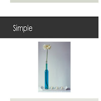
You must make your slides simple, no matter how complex the information being conveyed.
-
What is the gist of your presentation? You should be able to summarize your message in about 15 words. You will be repeating these words throughout the presentation. Then you will add details, explanations, and background to what you show on the slides as you speak.
-
If it takes more than a few seconds to understand the text on a slide, there’s too much text. The audience will spend its time reading instead of paying attention to what you are saying. Trying to do both at once means they will probably not do either thing well enough.
-
Space around the text on your slide can help focus audience attention. Fewer words can be as powerful as a barrage of information. Bullets are optional in making a list.
-
Charts and graphs can be so visually complex that they become eye charts for the audience. What is the gist of the information presented in the graph? Think how to show that point simply.
-
-
2 Consistent
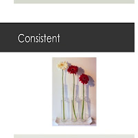
Consistency among your slides helps your audience focus on your spoken words rather than searching each slide for the meaning of its appearance.
-
Consistency is easier to achieve than simplicity. PowerPoint offers simple templates that provide visual consistency throughout your presentation. Choose a consistent theme for your template, making sure the text is readable against the background.
-
Use only one or two san serif fonts. These are the most legible types of fonts. San serif fonts include: Arial, Century Gothic, Franklin Gothic, Tahoma, and Verdana. Choose a font you like, and use it consistently to help your audience read your simple text quickly.
-
-
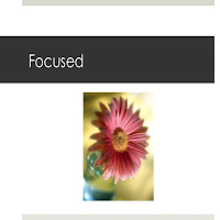
3 Focused
Your job as presenter is to change data into information, knowledge, and, you hope, wisdom. This means that during planning, your primary job is to focus the content.
-
What result do you want your audience to attain? Focus on that goal. Be sure you can summarize it simply. State it consistently. All the other information you provide is ancillary.
It is not your responsibility to be a resource library on the topic. Rather, it’s important that you accept the responsibility to funnel and filter, to focus your message. The best gurus offer simple consistent advice.
-
This also means you must know your audience and its needs. Think about your presentation from their perspective. They will be! What did you include in your presentation that is uniquely valuable for that specific audience? There’s your focus.
-
Don’t trust your audience to draw their own conclusions. The beginning and end of the presentation should be a statement of your focus. Every good presentation is a sales presentation.
-
When you begin talking, you are building the infrastructure for your audience’s understanding. Create the framework at the start of your presentation by beginning from a concise statement of your focus.
-
When you stop talking, you begin a dialog with your audience, whether you have a formal Q&A or you simply leave them to think about what you have said. Therefore it is important for you to simply restate your focus as your conclusion.
-
-
4 Vivid
Each slide should convey one idea. Remember, your mission is to make the presentation simple and focused. Yet with short simple text on a slide, once your audience is done reading, what else will they be thinking about?
-
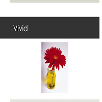
We are a visual culture. Images draw and focus our attention, and our stimulate thinking. Use images on slides to add an element of surprise. The audience should think “Oh!” when viewing the image you’ve chosen.
-
A good slide image isn’t simply a pleasant cosmetic. It is on the slide to help the audience focus on what you are saying.
-
Choose images that depict the content of your spoken presentation, that extend and enhance the printed text. The visual images you choose will create lasting mental images as they connect with your spoken words.
-
-
5 Show, not tell
We’re a visual culture and we need the combination of oral and text content and visual images for full understanding. This means you should not plan to read your slides. That’s your audience’s task.
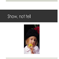
Your slides provide a vivid, focused support, a framework around which you fill in supporting details. The slides state the ideas simply, and you illustrate them with stories and anecdotes.
-
Stories help create emotional connections between ideas. They can be both entertaining and informative. People expect a dry presentation of facts leading to a conclusion when they read a research paper.
-
However, when attending a presentation, the audience expects in some measure to connect with the presenter. The audience hopes you will show them information, not tell it to them. The use of simple vivid stories helps your audience focus on your message and remember it after you are finished.
-
-
6 Rule of Thumb
I call this the 5-20-20-30 rule.
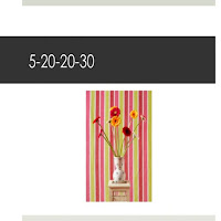
5 main points
Less is more. Don’t put your entire spoken presentation in your slides. As a rule of thumb, each slide should list a maximum of 3-5 main points. As you speak, you will expand those points.
-
20 slides
If you will speak for an hour, 20 slides is the maximum you probably need. Allow your audience to focus on simple text and vivid images as you tell them the message you want them to remember.
-
20 seconds
That’s the maximum time you want your audience to use in absorbing the content of the slide. You want them to focus on your words as you tell the story that will help them remember your message.
-
30 point font
This rule of thumb has two purposes. First, it ensures legibility. More important, it ensures simplicity. If you find yourself using smaller fonts to squeeze in more words, you probably have too many words on the slide.
-
That’s it in a nutshell. Planning the slides for your presentation takes effort. You want your message to be focused and simply stated. The slides need to be vivid, yet consistent in appearance. The visual presentation shows what you mean by adding another sensory input, while you tell your story.
*****
-

Planning Effective Slides for Presentations
Gentle Heron -- Virtual Ability, Inc.
-
A talk presented in Second Life at the Nonprofit Commons Meeting, Oct 7, 2011
http://maps.secondlife.com/secondlife/Plush%20Nonprofit%20Commons/88/127/26
NPSL Nonprofits in Second Life
-

This mini-lesson is about designing an effective professional presentation. It is not about the software you may use (often PowerPoint), nor is it about the projection technology. We will not discuss the best way to deliver a presentation in front of an audience.
-
Rather our topic is the way you think about and design the visuals that accompany the presentation. Your overall goal is to make the content clear, relevant, and memorable.
-
Remember, your PowerPoint slides are used to enhance your overall presentation, not to replace you. So here are five ideas and a rule of thumb to help you plan a presentation that uses slides.
-
-
1 Simple
It’s not a matter of keeping it simple. Often the information you will convey orally is not simple.
You must make your slides simple, no matter how complex the information being conveyed.
-
What is the gist of your presentation? You should be able to summarize your message in about 15 words. You will be repeating these words throughout the presentation. Then you will add details, explanations, and background to what you show on the slides as you speak.
-
If it takes more than a few seconds to understand the text on a slide, there’s too much text. The audience will spend its time reading instead of paying attention to what you are saying. Trying to do both at once means they will probably not do either thing well enough.
-
Space around the text on your slide can help focus audience attention. Fewer words can be as powerful as a barrage of information. Bullets are optional in making a list.
-
Charts and graphs can be so visually complex that they become eye charts for the audience. What is the gist of the information presented in the graph? Think how to show that point simply.
-
-
2 Consistent

Consistency among your slides helps your audience focus on your spoken words rather than searching each slide for the meaning of its appearance.
-
Consistency is easier to achieve than simplicity. PowerPoint offers simple templates that provide visual consistency throughout your presentation. Choose a consistent theme for your template, making sure the text is readable against the background.
-
Use only one or two san serif fonts. These are the most legible types of fonts. San serif fonts include: Arial, Century Gothic, Franklin Gothic, Tahoma, and Verdana. Choose a font you like, and use it consistently to help your audience read your simple text quickly.
-
-
3 Focused
Your job as presenter is to change data into information, knowledge, and, you hope, wisdom. This means that during planning, your primary job is to focus the content.
-
What result do you want your audience to attain? Focus on that goal. Be sure you can summarize it simply. State it consistently. All the other information you provide is ancillary.

It is not your responsibility to be a resource library on the topic. Rather, it’s important that you accept the responsibility to funnel and filter, to focus your message. The best gurus offer simple consistent advice.
-
This also means you must know your audience and its needs. Think about your presentation from their perspective. They will be! What did you include in your presentation that is uniquely valuable for that specific audience? There’s your focus.
-
Don’t trust your audience to draw their own conclusions. The beginning and end of the presentation should be a statement of your focus. Every good presentation is a sales presentation.
-
When you begin talking, you are building the infrastructure for your audience’s understanding. Create the framework at the start of your presentation by beginning from a concise statement of your focus.
-
When you stop talking, you begin a dialog with your audience, whether you have a formal Q&A or you simply leave them to think about what you have said. Therefore it is important for you to simply restate your focus as your conclusion.
-
-
4 Vivid
Each slide should convey one idea. Remember, your mission is to make the presentation simple and focused. Yet with short simple text on a slide, once your audience is done reading, what else will they be thinking about?
-

We are a visual culture. Images draw and focus our attention, and our stimulate thinking. Use images on slides to add an element of surprise. The audience should think “Oh!” when viewing the image you’ve chosen.
-
A good slide image isn’t simply a pleasant cosmetic. It is on the slide to help the audience focus on what you are saying.
-
Choose images that depict the content of your spoken presentation, that extend and enhance the printed text. The visual images you choose will create lasting mental images as they connect with your spoken words.
-
-
5 Show, not tell
We’re a visual culture and we need the combination of oral and text content and visual images for full understanding. This means you should not plan to read your slides. That’s your audience’s task.

Your slides provide a vivid, focused support, a framework around which you fill in supporting details. The slides state the ideas simply, and you illustrate them with stories and anecdotes.
-
Stories help create emotional connections between ideas. They can be both entertaining and informative. People expect a dry presentation of facts leading to a conclusion when they read a research paper.
-
However, when attending a presentation, the audience expects in some measure to connect with the presenter. The audience hopes you will show them information, not tell it to them. The use of simple vivid stories helps your audience focus on your message and remember it after you are finished.
-
-
6 Rule of Thumb
I call this the 5-20-20-30 rule.

5 main points
Less is more. Don’t put your entire spoken presentation in your slides. As a rule of thumb, each slide should list a maximum of 3-5 main points. As you speak, you will expand those points.
-
20 slides
If you will speak for an hour, 20 slides is the maximum you probably need. Allow your audience to focus on simple text and vivid images as you tell them the message you want them to remember.
-
20 seconds
That’s the maximum time you want your audience to use in absorbing the content of the slide. You want them to focus on your words as you tell the story that will help them remember your message.
-
30 point font
This rule of thumb has two purposes. First, it ensures legibility. More important, it ensures simplicity. If you find yourself using smaller fonts to squeeze in more words, you probably have too many words on the slide.
-
That’s it in a nutshell. Planning the slides for your presentation takes effort. You want your message to be focused and simply stated. The slides need to be vivid, yet consistent in appearance. The visual presentation shows what you mean by adding another sensory input, while you tell your story.
*****
- What do we do in Virtual Worlds?
- Search on page with Google Chrome: Ctrl+f, search bar upper right
- Google search this blog, column on right
- or put site:virtualoutworlding.blogspot.com at the end of the search terms
- Annotated screen shots made with Jing
- Creative Commons License, attribution only.
- Second Life, Linden, SLurl, and SL are trademarks of Linden Research Inc.
- This blog is not affiliated with Second Life or anything else.
- Ads are from Google
-
- Drop by my place in Second life
- Location Link. Click to go or drag to the viewer screen:
- http://maps.secondlife.com/secondlife/Cookie/136/100/22
- Feel free to send me an IM, notecard, or friend request.
- Thinkerer Melville/Selby Evans
No comments:
Post a Comment
Note: Only a member of this blog may post a comment.